Controlling Font Sharpness and Anti-Aliasing
Master the edge rendering of your bitmap fonts. Adjust sharpness to control anti-aliasing, from perfectly smooth (0%) to crisp and pixel-perfect (100%).
The Sharpness setting controls anti-aliasing and edge rendering of your font glyphs, on a scale from 0% to 100%:
- 0% Sharpness means full anti-aliasing, giving you the smoothest possible edges. Best for clean, modern text at larger sizes.
- 100% Sharpness means no anti-aliasing, producing crisp, pixelated edges. Good for retro games, pixel art, or small text that needs to be readable.
Visual Comparison
Section titled “Visual Comparison”The difference is visible up close: 0% creates a gradient of pixels to smooth edges, while 100% uses a hard on/off transition.
| 0% Sharpness (Smooth) | 100% Sharpness (Crisp) |
|---|---|
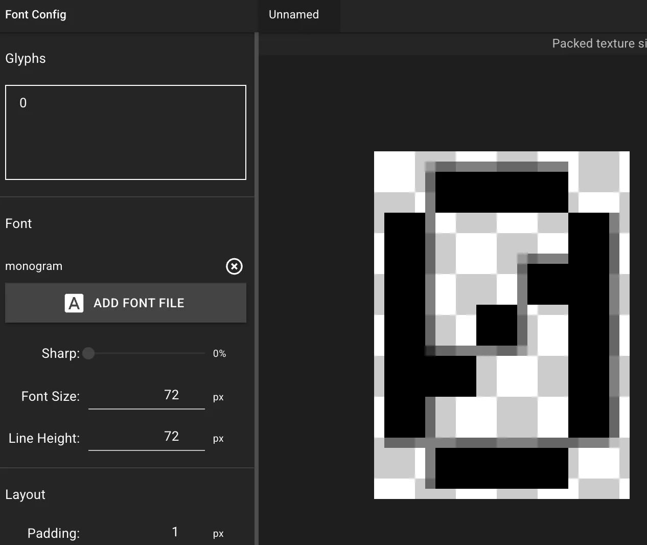 | 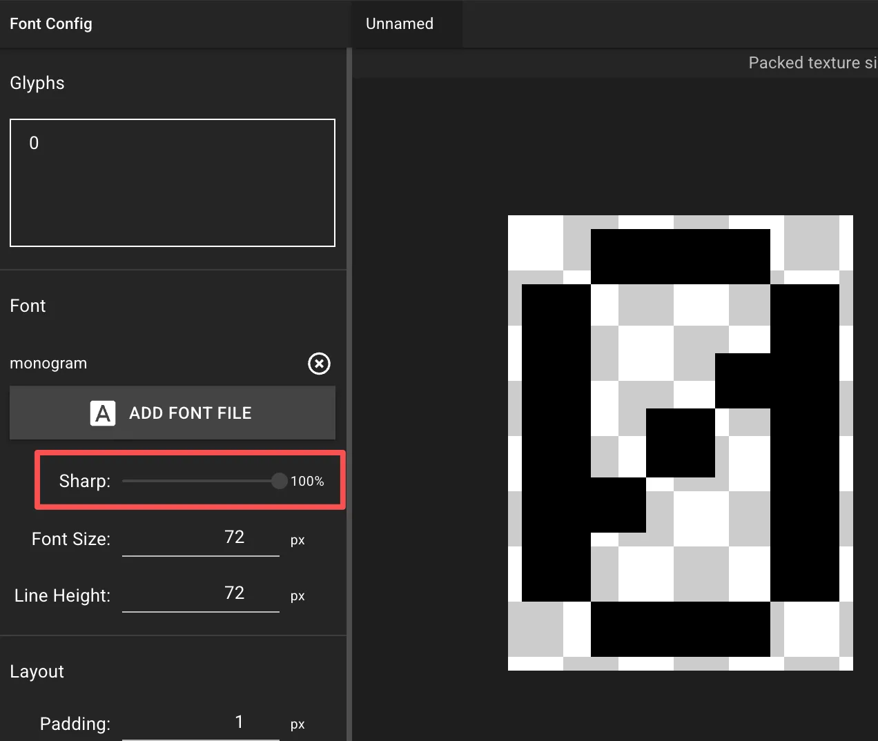 |
Choosing the Right Sharpness
Section titled “Choosing the Right Sharpness”- Smooth, professional look: Low values (0-25%) work best for larger text where smooth curves matter.
- Pixel-art or retro style: High values (75-100%) produce crisp, blocky edges aligned to the pixel grid.
- Balanced approach: Mid-range values retain edge definition without heavy pixelation.
Important Notes
Section titled “Important Notes”- Only available when a font file is loaded.
- Higher sharpness produces smaller texture files (fewer semi-transparent pixels to store).
- Lower sharpness improves readability for complex characters at large scales.