Kerning Pairs: Adjust Character Spacing for Better Readability
Optimize your font's character spacing by configuring kerning pairs for a professional and polished text layout.
Kerning adjusts the space between specific character pairs so text looks visually balanced and readable. SnowB BMF gives you direct control over kerning pairs to fine-tune your bitmap font’s layout.
Visualizing the Impact of Kerning
Section titled “Visualizing the Impact of Kerning”Kerning corrects awkward spacing between letters so text reads more naturally:
| Before: Default Spacing | After: Optimized with Kerning |
|---|---|
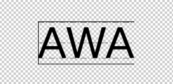 | 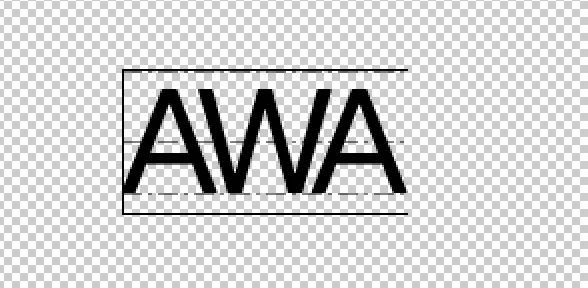 |
How to Configure Kerning Pairs
Section titled “How to Configure Kerning Pairs”1. Activate Preview Mode
Section titled “1. Activate Preview Mode”Click the Preview button in the main toolbar. This renders your text with visual guides for kerning.
2. Define a Kerning Pair
Section titled “2. Define a Kerning Pair”Type the two characters you want to kern in the preview text area. For example, to adjust the spacing between ‘A’ and ‘W’, type AW.
3. Adjust the Spacing
Section titled “3. Adjust the Spacing”Click on the first character of the pair (e.g., the ‘A’ in AW). The kerning panel will appear, allowing you to adjust the spacing between it and the next character.
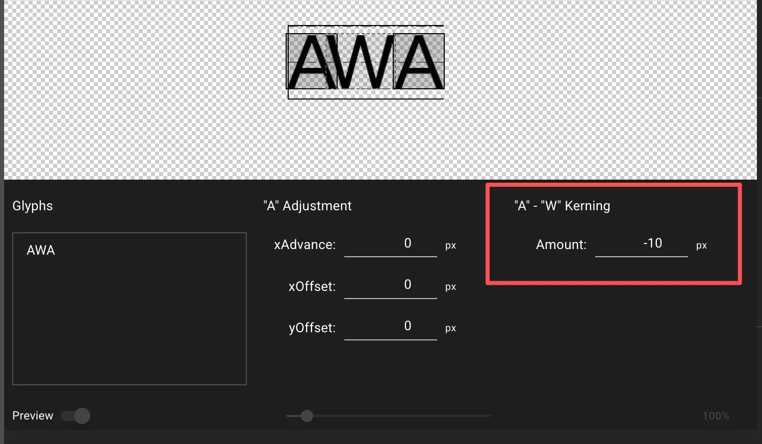
- Amount: This is the kerning value in pixels.
- A negative value (
-10) moves characters closer. - A positive value (
10) pushes them farther apart.
- A negative value (
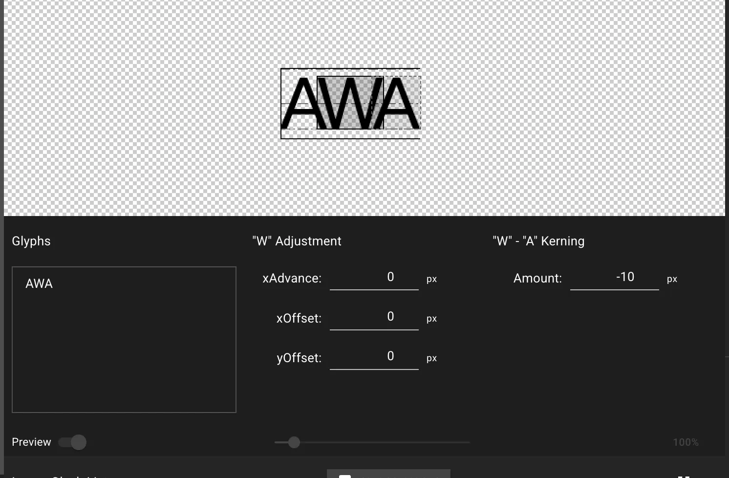
Changes appear in real-time in the preview area. To adjust the kerning for WA, simply type WA and select the ‘W’.
Best Practices for Professional Kerning
Section titled “Best Practices for Professional Kerning”- Use Real Words: Test with actual words and sentences to see pairs in context.
- Focus on Common Pairs: Prioritize problematic combinations:
AV,AW,VA,WA,To,P.,Yo. - Trust Your Eyes: Aim for perceptual balance, not mathematical equality.
- Make Small Adjustments: Adjust 1-3 pixels at a time for best results.